 Conversion optimization is one of the most important pieces to the digital marketing puzzle. If you cannot convert your traffic then you are wasting your time and money. I have worked on many conversion campaigns over the years, but I wanted to show a case study where I was able to more than double a conversion rate. I am not able to go into detail on who the company is, but I can tell you that they are a credit report company, similar to FreeCreditScore.com.
They generate leads on a pay per lead basis, so they pay only when a person enters their website and converts into a lead (fills out the forms). This company has many partners that drive traffic to their landing page and the partner gets paid when the traffic converts into a lead. Since this is their primary lead source, it is very important for them to make sure that the traffic converts.
Email marketing is where they were lacking and converting email traffic is different than web conversions. Plus, email marketing leads are much better quality. When this company came to me they were doing a 1% conversion. To compare, their big brand competitors are doing about a 3.5 – 4% conversion rate. Since this company is not a big brand, they know they will not achieve these numbers, but would be happy to at least get close.
After changing the landing pages and making many tweaks, I was able to get their conversion ratio up to 2.55% from 1%. They know it will be very hard to achieve a 3%+ like the big brands do, but they are ok with that. When you are able to double the conversion rate for any company, the reward is tremendous. This company is already very good at generating revenue from their leads, so doubling their conversions while spending the same on marketing, is a huge win.
How these results were achieved
Page 1:
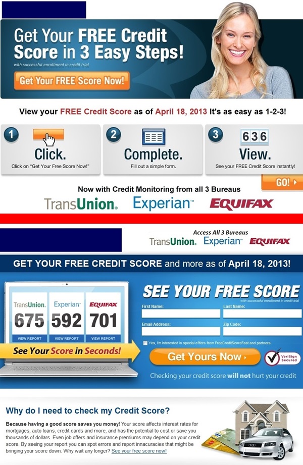
Below you will see the old landing page (top) and the new landing page (bottom). The biggest change was the fact that the old landing page wasn’t an actual landing page, you had to click to get to the first short form. This is not a good idea when it comes to conversions because you want the potential lead to do as minimal work as possible to start providing their information.
Other changes on this page:
- Added big yellow arrow – You should direct people to what you want them to do. If you want a form filled out, then point them in that direction. But also make sure the arrow is visible and draw attention to it. It was important to make sure the arrow stuck out a little to the right because when it was moved to the left it got lost.
- Got rid of the woman because it was a lot of wasted space. You want to get as much information above the fold as possible
- Took the important logos of the credit score companies and moved them to the top so they are easily seen. You want people to trust the website, especially when you are not a major brand, so they don’t run away. So the logos are more important to have at the top than the woman
- Got rid of all the orange and made just 1 orange button on the page. Very important not to take focus away from what you want people to do. A lot of the same color can make people lose focus
- “See your score in seconds” was added to show that this wasn’t going to take a long time
- Added the VeriSign logo so they feel know the site is secure
You can see there were other changes, but these are the big changes for this page.
Page 2:
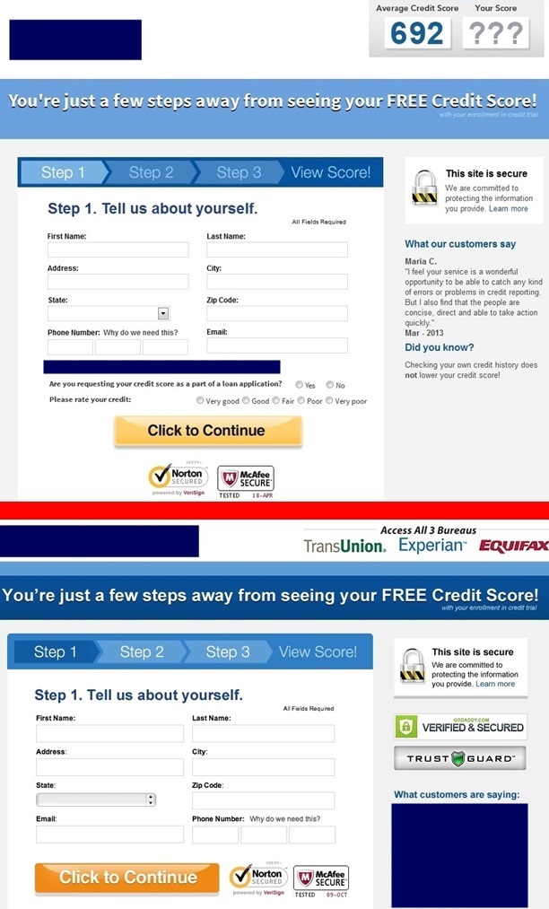
As you can see there is more than 1 page in this process. You want to keep the amount of pages to a minimum, but because of the business, multiple pages are necessary. You can see old page 2 (top) and new page 2 (bottom) below. The big changes to this page are…
- Moved the company logos to the top right and got rid of the credit report scores. Again, it is important to keep the trust of the visitors high throughout the process, since they can leave at any time
- There were 3 secure logos on the old page. We added 2 more on the right side of the page and moved the 2 below the continue button to the right of it, so they are more visible. Since you are asking for social security and credit card in the same lead form, it is very important to keep the trust factor high throughout
- The whole page was shortened
Page 3:
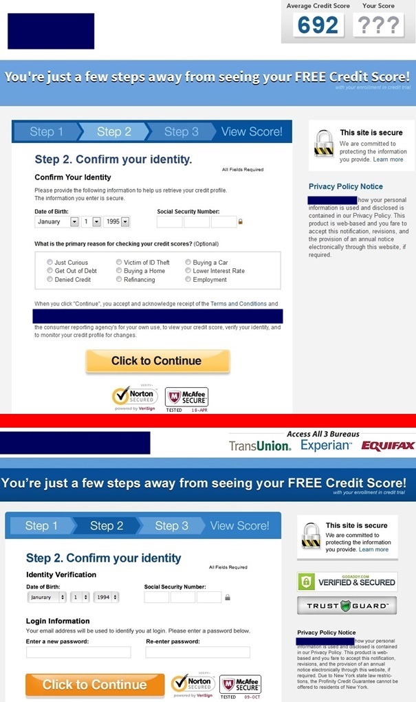
Page 3 of the process is below, old page is on top and new page is on bottom. We are starting to get into the hard data to convert. Social security number and credit card. This is where the leads start to fall off. Since social security number is probably the hardest thing to get from someone who doesn’t know who the company is, it is important to make the person feel like they are getting something in return.
- You can see on the old page, they ask for the information and that is it. On the new page, the same information is asked for minus the optional questions, but they are also asked for a password to setup their account. It is important to make the visitor feel like they are getting something in return for their information
- The other changes stay constant, the extra secure logos and the company logos. It is also very important to keep all the pages looking to same throughout the process
Page 4:
Page 4 is below, old on top and new on bottom. This is it, does the visitor turn into a lead or not? This lead form is for a free trial, but of course credit card information is asked for to verify identity, plus to start billing the person after the free trial is over. Don’t we all love these types of offers?
- On this page the company logos are still on top but the secure logos on the right side are gone. Reason is, you need to do some sales here. Asking for credit card info is just as hard as social security number, but the additional sales information is to push them over the fence, if they are sitting on top of it
- We got rid of the shopping cart since that feels like a purchase is being made. When you are pushing a free trial offer you do not want the person to feel like they are buying something, once they feel they like they are paying they are probably going to leave
- The graph on the right is to show that this is a good life decision and it will help them in multiple ways. Just like in any sales situation, have to make them feel like they are doing something good for themselves

Statistics:
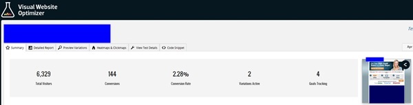
Below is a screen shot of the stats, which shows a conversion rate of 2.28% combined between the different variations. The variation I discussed above achieved a 2.55% conversion ratio. Yes, I should have got a screen shot of that, but that is ok.
What have we learned?
When you ask for very personal information like social security number, expect low conversions, even if you are a big brand. You have to “massage” your potential leads, make them feel secure, safe and that they aren’t going to become another statistic of identity theft. There are other things that can be added to the landing page like live chat, phone support, etc… which is what bigger brands can do, but when you are a smaller company that is trying to compete on price, those resources are hard to provide.
Understand that web conversions will be higher than email conversions, typically. Email leads are better quality from my experience.
There are many ways to increase your conversion ratio, all you have to do is test and put yourself in your visitors shoes or just hire an expert.